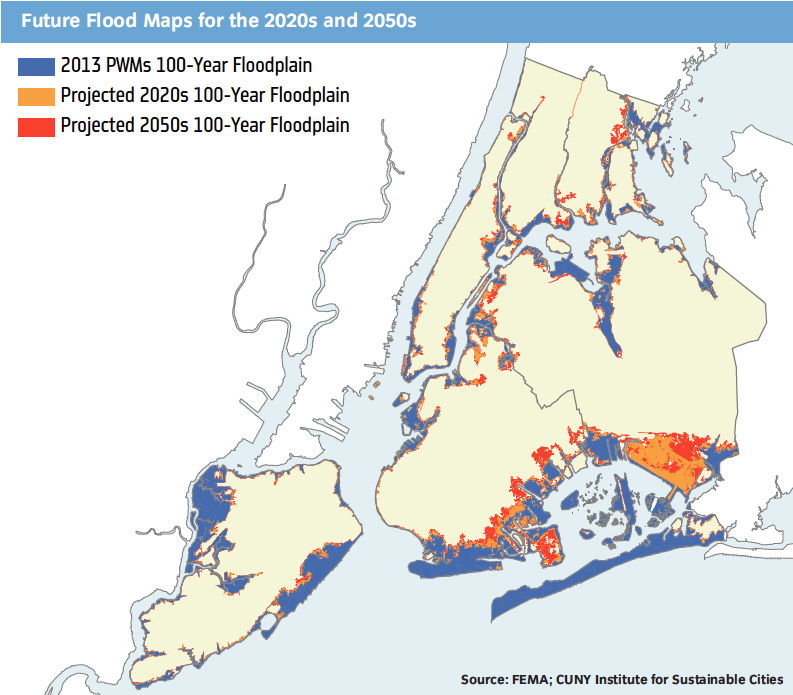
New York’s flood projections for coming decades are created by the CUNY Institute for Sustainable Cities (CISC). We asked Lesley Patrick, program manager for CISC and technical lead on the mapping, to describe the process of developing these maps, which will be vital guides for the City moving forward. At the bottom of this post we include an interactive version by AdaptNY that extends projections to 2080.
______
On June 11, 2013 the Bloomberg administration released their 438 page PlaNYC report ‘A Stronger, More Resilient New York’, detailing the City’s plans to prepare for climate change impacts. Critical to informing that report of the relevant emerging climate science is the new release from the New York City Panel on Climate Change (NPCC) titled ‘Climate Risk Information 2013: Observations, Climate Change Projections, and Maps’ (CRI 2013). The CRI 2013 contains updated future climate projections for New York City, including data on mean annual temperatures, total annual precipitation, sea-level rise, and extreme events.
To illustrate the impact of accelerated sea-level rise in the NYC region, CISC created two ‘Future Coastal Flood Risk Maps’ that are featured in both the CRI 2013 and the PlaNYC reports. The first map illustrates the potential 100-year flood zone in the 2020s and 2050s and the second illustrates the potential 500-year flood zone for the 2020s and 2050s. These maps are a follow up to the 100-year flood maps that CISC created for the NPCC 2010 Report ‘Climate Change Adaptation in New York City: Building a Risk Management Approach’, though the timeframe and surge extent has changed. The 2010 report featured the 100-year flood scenarios for the 2020s, 2050s, and 2080s while this 2013 effort features maps of both 100- and 500-year flooding, but for the 2020s and 2050s only.
Maps were created in ESRI’s ArcGIS over a period of three months in the spring of 2013. CISC developed a methodology that uses FEMA’s base flood elevation (BFE) values*, adds projected sea-level rise values to the BFEs, and then projects the new BFEs landward until they reach an equivalent topographic elevation. For the 2013 effort we started with the FEMA’s Advisory and Preliminary Work Maps for New York City, added high-estimate (90th percentile) projections of sea-level rise to the existing BFEs, and then directed the GIS (Geographic Information System) to select as ‘flooded’ the land between the coastal flood zone and nearest inland equivalent topographic elevation. The NPCC2 defined high-estimate (90th percentile) sea-level rise values as 11 inches for the 2020s and 31 inches for the 2050s.
Mapmaking in a GIS can pose challenges of both data and processes. The flood risk maps involved manipulating large raster datasets and vector shapefiles through multiple lengthy geoprocesses. Several iterations of these processes were often necessary to refine the final product and confirm that the outcome was consistent. Datasets were frequently swapped out to ensure we were using the best available data.
Despite the challenges, this map product adds value and meaning to the numeric projections of sea-level rise. Visual imagery of storm surge is essential in conveying to decision makers, stakeholders, and the public the increased risk of flood exposure due to higher seas. Because the vast majority of New York City is higher than 10 feet in elevation, the high-estimate projections of approximately 2 and ½ feet of sea-level rise by the 2050s will be problematic for most New Yorkers only during storm surge events (hurricanes and nor’easters) and high astronomical tides. However, due to sea-level rise, future storm events and astronomical tides need be of much smaller magnitude to achieve the levels of flooding that we experience today from higher magnitude events. And future storm and tide events of large magnitude will achieve new flood heights and extents.
The maps illustrate who is currently at risk of flooding, who may be at risk in the future, and who will likely not be a risk during the timeframe of this study. They highlight how flood risk to populations and infrastructure will change by mid-century and, provide a baseline for discussion of shoreline use and development, flood insurance regulations, and mitigation and adaptation efforts.
*Base flood elevations are defined by FEMA as the computed elevation to which floodwater is anticipated to rise during the base (100-year) flood.
_____
Below is an interactive, fully zoomable version of maps for 2020, 2050 and 2080, built by AdaptNY using the NYC OpenData set created from an earlier set of CISC maps. AdaptNY is also studying how community boards respond to the City’s planning and outreach effort, including the benchmark SIRR report informed by the projections in these maps.
