[pullquote align=”left”]People can understand information at a higher level when they are looking at it visually.[/pullquote]Tell us what CUP (The Center for Urban Pedagogy) is all about?
CUP is a nonprofit, and our mission is to use art, design and visual culture to improve civic engagement.
There are a lot of barriers to meaningful civic engagement. The part that we work on is understanding the complex decision making systems that shape the city. Things such as policies, planning issues, and processes that shape the communities where we live.
We collaborate with other artists, designers, visual thinkers, community organizations and advocacy groups — we bring those folks together and look at different issues, try to break them down and create really accessible visual explanations, so that more people can understand how the systems work and productively contribute to their communities.
We have two program areas: Youth Education and Community Education. In Youth Education, we work primarily with New York City public high schools. We develop in-school projects and then some afterschool and summer projects. All of our projects start by asking a question about how the city works — like, “Where does the water go when I flush the toilet?” or “Who picks the food that’s in my bodega?”
Questions about the neighborhoods that the students live in. These are questions that we don’t know the answers to either, so as a group we investigate the issue.
We train the students to be really good researchers, and to ask really good questions. We then set up interviews with a bunch of different urban stakeholders. The students get to meet with a range of people who have a lot of different ideas about a given topic. Often the stakeholders will all sound like they’re all saying pretty reasonable things, so the students will have to decide what shades of agreement they have with the different people they are talking to.
Where does design fit in?
As they are interviewing people, the students are also working with a teaching artist who will help them produce visual work about what they are learning. This is a way to help process the newly learned information. At the end of the project they produce a visual explanation, which they display publicly and which we often distribute to community groups who are working on the same issue.
For instance, we did a project with The Academy of Urban Planning in Bushwick: a triptych representing what the city means to different people…a little girl, an old lady, a homeless person, and a few others. What these people saw as threats or opportunities in the neighborhood. How they would look at the kind of conditions around them.
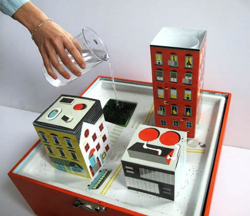
And we did a project called Sewer in a Suitcase. This project actually grew out of a working model made by students looking at the city’s combined sewer system in New York and how it works. You put water into it and you see how it gets polluted. The students made the original model, and it was so popular, and enough people wanted to use it for workshops, that we got a follow-up grant to work with a designer to produce a more robust version. Now we distribute them to environmental education centers and schools.
So you produce lots of things…posters, pamphlets, 3D objects?
Yes, and lots of videos as well. There is a broad range of visual media that students create to share what they learned. The students who worked on Sewer in a Suitcase also worked on video called The Water Underground. We are also just wrapping up a video for the project What The Cell? Which looks at cell phone infrastructure in the city.
In our Community Education program it’s kind of the same idea. There is a visual aspect and the actual issue that we are working on. In Community Education, most of our projects are custom tools that we produce around specific issues for an organization or a group that are really worried about a particular issue. They look for visual tools that can help them explain what they are working on to others so they can continue to do their organizing and advocacy work.
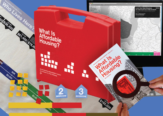
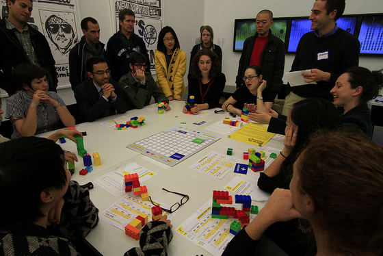
For that, we have two core programs. Envisioning Development Toolkits – which are a series of workshop tools that we’ve made. When they talk about neighborhood development issues with their constituents, community groups find that they often have to re-explain some of the more complex information over and over again. Some of the issues are really technical, and they’ve asked for tools that could help them explain things more quickly, so they can get to the organizing part.
Behind you is actually one of the prototypes for the Affordable Housing Toolkit.
I have that book – What is Affordable Housing? It’s great!
We’re now finishing up a new edition, to be reissued with an updated version with updated figures from the last census.
Groups run workshops on this topic all the time. These tools help people visually understand affordability programs and how they relate to specific populations in their neighborhood. It helps people get to the point where they are making suggestions for policy very quickly! It is always really striking when that happens. Now we are doing a follow up toolkit that looks at zoning.
Our other big project in Community Education is called Making Policy Public. This is our poster series — which is what most people have seen.
[pullquote align=”right”]Having feedback from the community gives designers more insight.[/pullquote]Every year we have an open call for new topics; we ask community groups what they have been trying to explain to their constituents.
Then, we have a jury of two advocacy people and two art and design people who help us pick the next topics. We follow with a call for designers, and over the next year our staff will collaborate really closely with those teams and help them produce foldout posters that explain the issue in question.
We just produced our ninth one, and next we are putting one together looking at “Hydraulic Fracturing,” how it works and how it impacts the environment.
We are also doing another with a group called Domestic Workers United, who successfully got some legislation passed last year called the “Domestic Workers Bill of Rights.” Because domestic workers do not work in a single, centralized location, many of them don’t know about the new rules and it’s hard to get the word out to them. So we are helping to make this poster that can be distributed at places like parks where the nannies gather and places where there are smaller gatherings points of domestic workers, to spread the word.
CUP created a really great project two years ago — a comic book guide to the juvenile justice system in New York City. When we finished that one, the Department of Probation ordered 20,000 copies and they distributed it directly to kids who get arrested.
That is an amazing achievement!
Yes! That is one of our most exciting impact stories.
Why was visual communication specifically chosen to demystify these urban issues?
There are a lot of aspects of visual communication that are really helpful. Visuals mean that we are getting to more people. We work with a really diverse range of communities, there are often many languages being spoken, and certainly many people coming from different reading levels. This happens perhaps because they have different education levels or just a different level of understanding English because it is a second or third language to them. These are some of the most vulnerable populations to begin with, so it becomes really important to convey the information visually.
We also find that people can understand the information at a higher level when they see it visually, because they can understand the patterns. People start to understand how the system hangs together and how a small intervention can affect the system.
We also find that aesthetics are important. We try to make things be a little bit playful and unexpected. Our work has a disarming impact and it doesn’t look like an official government document. People don’t approach it as they might a government document, it makes that process a little less scary.
The project Sewer in a Suitcase is interesting because we have encountered organizers who looked at it and said, “Oh, it’s for kids.” We respond by saying, “Sure, if thats the way you want to look at it.”
Then we show them how it works, and they say “Oh my gosh — I have been working on this issue for six months and I hadn’t totally understood it, until I saw this!”
People are less afraid of these projects because they look like they are for kids. They’re not intimidating, and don’t expect anything from the viewer or user. People don’t have to come to it with any prior knowledge and so they relax around the tools. That is something we think a lot about — how do you get people to approach the information?
With our community projects, we work to get feedback about the graphics by the group that will actually be using them. This is great for the designers because they often don’t have that type of process when they are working. From there we are able to really get the work to speak to the audience, because they are part of the process with us.
[pullquote align=”left”]Students can ask questions about the communities they live in, like “Who picks the food that’s in my bodega?”[/pullquote]That is great! Often in the design process a designer is creating something far removed from those who are actually using it. To have that type of feedback could be pivotal in shaping the usefulness of the final product.
When we are first starting a project there are so many directions it could go. The designer might intend for something to mean one thing, but then the audience looks at it and reads it as something entirely different. Having feedback from the community gives the designer more insight.
As you’ve mentioned, CUP’s work deals with demystifying often perplexing or obscured policy laid out by higher ups. Do you think these policies are made to be that confusing? Is there just a lack of consideration on behalf of policy makers who are crafting policies that the everyday person just doesn’t understand?
I think both. It depends on the specifics of the situation. There are definitely times when I look at something and I think that is was purposefully made to be confusing. If you look at the city’s zoning maps, they are really really hard to read, even for people like myself with graduate education in architecture and urban planning. No one has tried to make that information more accessible. We are too far into the game for that not to be on purpose. However, sometimes you will see that there are moments where the government is trying to break things down, and they fail, possibly because they don’t have the correct language. The ways that they might explain a subject might not be easily understood by those who are affected by the policies.
A lot of the individuals we collaborate with for Making Policy Public are lawyers. The objective is to help them break through the legal language to get to an accessible language while still trying to maintain accuracy. It is a super hard task. Often we will go back and forth until we get to language that we feel everyone is happy with. It’s important to have that precision, it is easier to just fall back on the legal jargon. I think a lot of times that is what is happening.
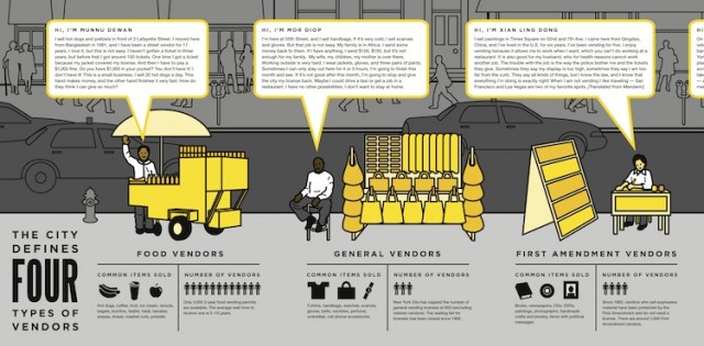
Beyond the language, there is also an accessibility issue. As a citizen, it is pretty difficult to get your hands on the actual laws and the pieces of paper that say the things that affect your day to day life. We made a Making Policy Public on street vendor regulations, and it is so interesting to look at the actual street vendor codes. There are pages and pages that say “Fifth avenue between 32nd and 33rd on the west side…etc.” This code book could simply just be a two page map, but instead it is pages and pages of text about if it is ok to park your cart on any given block. You have to leaf through all these pages, which is hard for someone to actually go sit down and search through. It is not like you can take it with you and read through it at home.
On each project, there are a lot of collaborators that CUP works with – teaching artists, designers, community groups, policy makers and planners – is it difficult being so collaborative?
Yes of course! But it is great too! What makes this type of work awesome is the challenge. We work in super multi-disciplinary collaborations with diverse individuals coming with their own frameworks, goals and expectations. It is our role to bring everyone on the same page. There are definitely times when projects go of the rails a little bit, and we are there to guide everyone in the right direction.The design process is a messy one. Designers know that there is that stage when things are really messy and up in the air. The other partners that we work with often haven’t collaborated with designers before, and there comes a point when the project just feels out of control. We have to show them that something amazing is going to come out of this process. In the end this is a new process for some people and it turns out to be really fun for them.
[pullquote align=”right”]All of our projects start by asking a question about how the city works.[/pullquote]How are the issues that CUP explores discovered or chosen?
When CUP first started, it was just a group of people really interested in the city, who started to do research into topics interesting to them.
This research often ended in exhibitions. From there they partnered with a bunch of different people, and although they liked the final exhibitions, once the show ended the useful life of the work that CUP produced ended.
That lead us into this direction. We now try to make ways in which the audiences and constituents we serve are involved in helping shape our programs and determine which topics we work on.
With Making Policy Public we do a call for groups that have been working on issues with specific constituencies, then we have the jury consider them. We make sure that candidates are groups who have really been working on these issues, know about the topic, and have the capacity to work on a visual product that meets a real need.
Our Envisioning Development Toolkits came out of informal conversations that we were having with groups and community organizations. We then turned those organizations into an informal community advisory board who help us pick our next set of topics. Each year we do a survey asking organizations about the big issues they have been working over the year, and which issues they could use help communicating. From these conversations we develop a sense of what is happening around us.
With our Youth Education programs we don’t really have a “client-driven” model, so to speak. The conversations we have with our partners really drive what is on our minds. Two summers ago when a lot of people were looking at “community benefit agreements,” there was a big city task force looking at how they work and whether or not we should have them. So many groups were trying to understand them at that time, so we decided to have our students create a project that looked at the issue. We always have our ear to the ground to discover relevant current issues.
It’s also nice for our youth education to work on problems that are in the news. Students have the sense that they are contributing information to an undecided issue. People take different positions and students see the the different sides of an issue and how decisions get decided. Those kinds of projects have a more immediate relevance to them.
CUP projects have been awarded many accolades for their design and have even been exhibited. Is it important to have visual consistency with your projects? Are you striving for an overall aesthetic?
I guess the overall answer would be no, because we don’t have visual consistency and we work with a lot of different designers. Literally every project has a different designer or artist that works with us, so outcomes are pretty varied. Certainly we art direct everything, and we push projects to a place where they are friendly, maybe playful or silly. We like the design of our projects to be unexpected but clear and communicative.
[pullquote align=”left”]Bringing design and community advocacy together is a perfect recipe for positive impact.[/pullquote]Do you think that learning to work with communities and diverse groups of people is an important skill for a young designer to have?
Definitely! I think on some level working with community groups is just like working with people in general. Treat them with respect and try to understand the context they are working in. It is really powerful when people come together. What CUP really tries to do is bring together people with different strengths into our projects so we can produce something really amazing.
One thing that I see in our industry is that designers are really interested in socially innovative work right now. Sometimes they can’t figure out how to produce it or connect to a real need so they will make self-generated projects, which is totally fine. However, I feel frustrated when those projects are rewarded as having an impact, when they really are not connected to any real need or project.
If there are issues that you care about, there is almost certainly a handful of groups that work on the same issue. Go out and find them, figure out what they need and see if there is a way you can help them and throw yourself into their process.
The organizers that we work with are so good at their work and really good at reaching people. And they often don’t have access to these visual tools which can make their community organizing work so much more effective. Bringing design and community advocacy together is a perfect recipe for positive impact.
At the end of the day what are CUP’s goals? What do you want to see happen in the future of New York City?
Our vision is that our work contributes to social justice. And our vision of social justice is that more people and more kinds of people from different backgrounds have more of an ability to influence the decision making in their communities.
About Christine Gaspar:
Christine Gaspar has over ten years of experience in community design. Prior to joining CUP, she was Assistant Director of the Gulf Coast Community Design Studio in Biloxi, Mississippi, where she provided architectural design and city planning services to low-income communities recovering from Hurricane Katrina. She holds Masters in Architecture and in City Planning from MIT, and a Bachelor of Arts from Brown University. She’s been a CUP fan since 2001, and a staff member since 2009.
Top photo by Maureen Drennan.
CUP projects courtesy of CUP.


