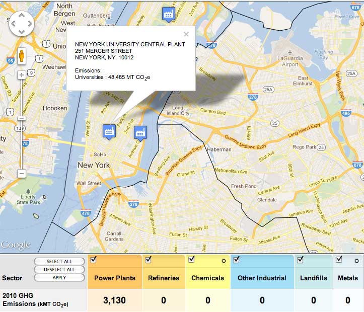
 The CO2 guide to NYC; not likely to be first resource a tourist asks for, but contains fascinating data, given our changing planet…as the city passes through a January in the 40’s and 50’s. The EPA has created an interactive national map of emissions sources, selectable by category and searchable by region (press release). The map is generated by the EPA’s database of “large facilities and suppliers” that are part of the EPA Greenhouse Gas Reporting Program. The project offers the public a new level of transparency for the location of large emissions sources, and gives businesses an incentive to improve relative to their peers.
Exploring the map, it’s hard to tell from clicking on an icon how efficient a facility may be when compared to whatever may have preceded it. NYU’s generating plant (selected on the image above) is a big emitter for Manhattan, but is also a success story of improved technology. NYU now gets 13.4 megawatts locally from a modern natural gas generating plant which is comparatively efficient.
Of course, CO2 (and other warming gases) emitted in the city are just a small fraction of the city’s total carbon footprint. Most electricity used in New York is generated outside the city, and New York depends on agriculture and manufacturing that produce emissions measured elsewhere. But to see the carbon activity of the city in detail is a good start to a more comprehensive profile of how the world works, and how our economic production may change in the years ahead. And having the data mapped resonates with other recent projects, where New York is defined by vulnerability to the sea, and by opportunities for solar.